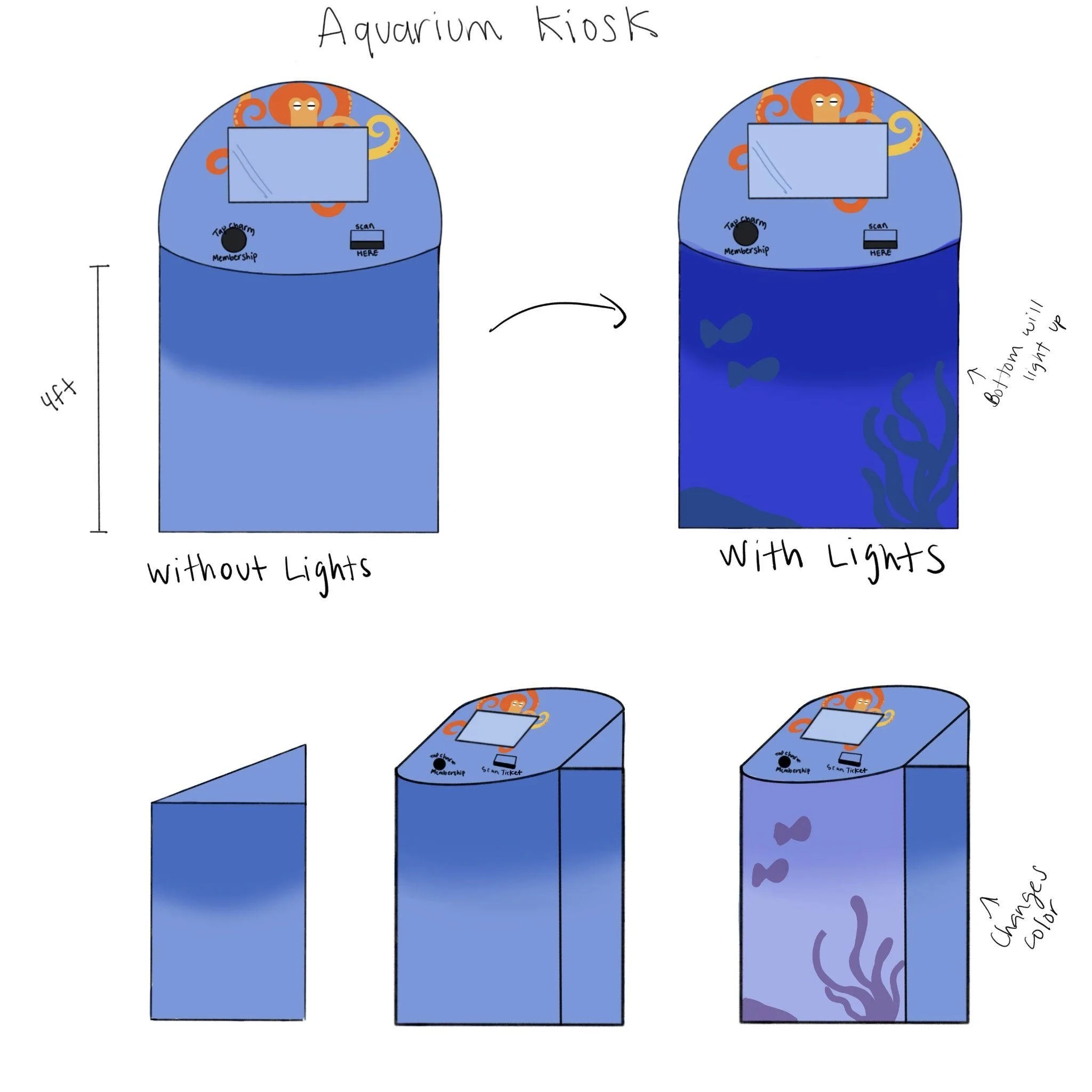
Birch Aquarium Kiosk
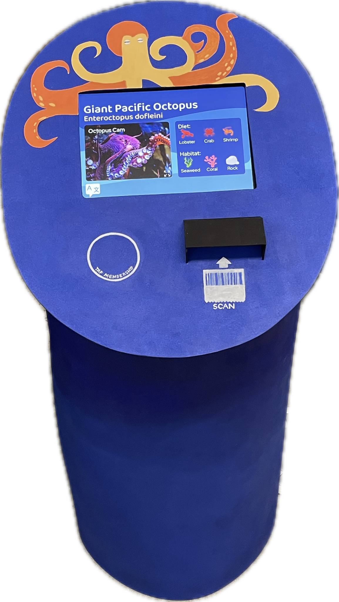
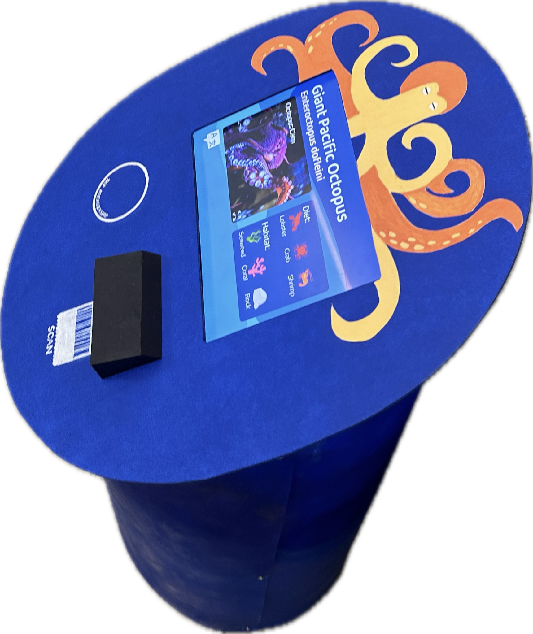
Birch Aquarium Kiosk is a project I did for my prototyping Class. Our kiosk design supplements the existing signs that display animal information, catches the attention for younger visitors, and provides incentive for visitors to apply for aquarium membership. The purpose of this project is to do hands-on design for a product, from conception to final product.
The Birch Aquarium Kiosk is a complete product with both hardware and software. My team and I started with need-finding, brainstorming and ideation, and field research to narrow our project to be a kiosk for museums and aquariums. We then created a few personas to represent our intended users, and drew storyboards to select interactions. We used existing Birch Aquarium style guide and our own moodboard to determine how the kiosk should feel. I used my own expertise in graphic design to complete a style guide for our product. From there, half of our team worked on fabrication of the physical kiosk while another teammate and myself worked on the UI of the kiosk. I confirmed our user flow with a user flow diagram. From there, we built up the UI from wireframe, to high fidelity prototype. In the end, our hardware and software teams came together to present our final product.
My Contributions
My Contributions
RESEARCH
I conducted online research and secondary research on the field we have previously selected. I found three sources that jumpstarted our project.
I also conducted field research with one of our teammates. We went to the Birch Aquarium in person to take note of the visitors’ profiles, and conducted quick interviews with some of them. This helped us create personas for our users later.
The existing informational plaque for the Giant Pacific Octopus at the aquarium. This is mandated by law. We will not be trying to replace it.
Some existing interactive exhibits at the aquarium.
PERSONAS
From the people we saw and interviewed at the aquarium, my team and I came up with some personas to represent the unique experiences and needs that aquarium visitors might have.
We condensed these personas into three core ones to focus on.
Our 3 core personas: the kid, the tourist, and the college student.
STORYBOARDS
Perhaps the greatest strength of a designer is their ability to convincingly tell a story.
Using the personas we created and the encounters we made in the field, I drew some storyboards to describe the users’ experience with our product.
“Finding the animal”, starring Kevin
“Language Barriers”, starring Christian and Esme
“the field trip”, starring Kevin
“the birthday present”, starring Judy and Stephen
“Stephen’s date”, starring Stephen
The storyboards went through a few iterations to represent our goal interactions better.
USERFLOW
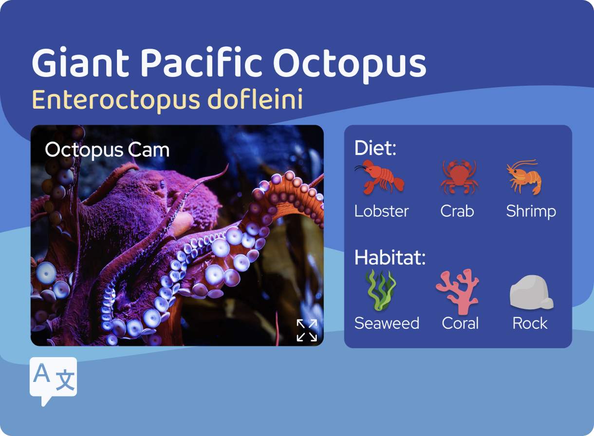
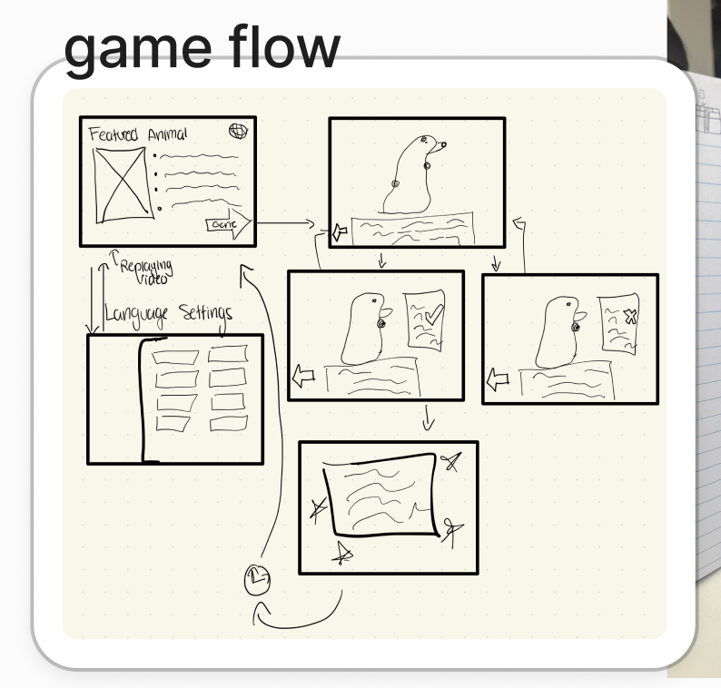
After finalizing which features our kiosk should include, I quickly drew a sketch of what the main menu could look like during a team meeting. After some back and forth, we decided that the kiosk should provide information on the animals’ habitat and diet, include a mini game, have a language selection screen, have a live cam for the animal, and provide a “gotta catch them all” animal collection system for aquarium members.
With these features in mind, I drew a user flow chart. This chart would dictate all of our future development.
Initial sketch of what various parts of the UI would look like
User flow chart
STYLE GUIDE
My team came together and made a mood board. The mood board helps us determine how our product should look and feel before we began our fabrication and design.
Our mood board.
It is important for each and every element of a product to feel congruent with each other. We looked at the existing branding and style guide of the Birch Aquarium, and from there developed our own style guide for the kiosk.
Birch Aquarium’s official branding guide
Our style guide
I also used my skills working with vector images to make a variety of buttons and icons.
WIREFRAME
After finalizing our style guide, my team split into two groups: 2 of my teammates worked on fabrication of the physical kiosk while another teammate and I worked on building the UI in Figma.
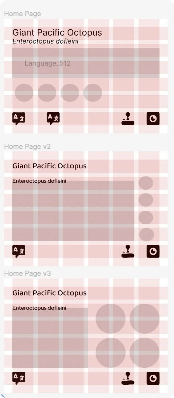
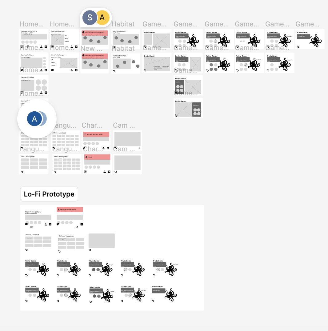
We started out by building a wireframe for our UI. Since the screen in the final kiosk would be an iPad, it was important for us to test the dimensions of our UI on the actual iPad screen before making a high-fidelity version. After some deliberation, I decided to structure the UI elements in a 6x6 grid.
UI wireframe with a 6x6 grid for the majority of the pages. The minigame, which we decided to make into a trivia, has a 12x8 grid.
Complete wireframe of the UI.
HI-FI PROTOTYPE
With the wireframe working on the screen as intended, it was time for us to add the assets to the UI and make it interactive. My teammate and I prepared a number of vector graphics and brought the UI into high fidelity.
Some of the high fidelity screen designs
Some assets used in the high fidelity prototype
With the high fidelity UI ready, it was time for us to conduct some user testing to fine tune the final design. We tested users that would be congruent with our imagined users, such as little kids and Spanish speakers. We then used what we learned to improve some of our layouts and design choices.
For features we weren’t able to make in Figma, such as the live octopus cam and the scanning of tickets and charms, we found clever ways to work around them:
The octopus cam is actually a GIF.
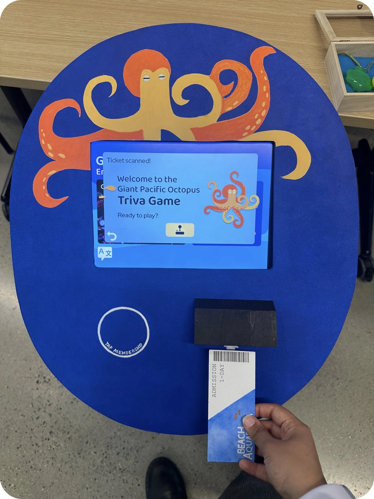
The scanning is done as a Wizard of Oz: when we see our users try to scan something, we hit an invisible button on the screen to trigger the interactions.
FINAL PRODUCT
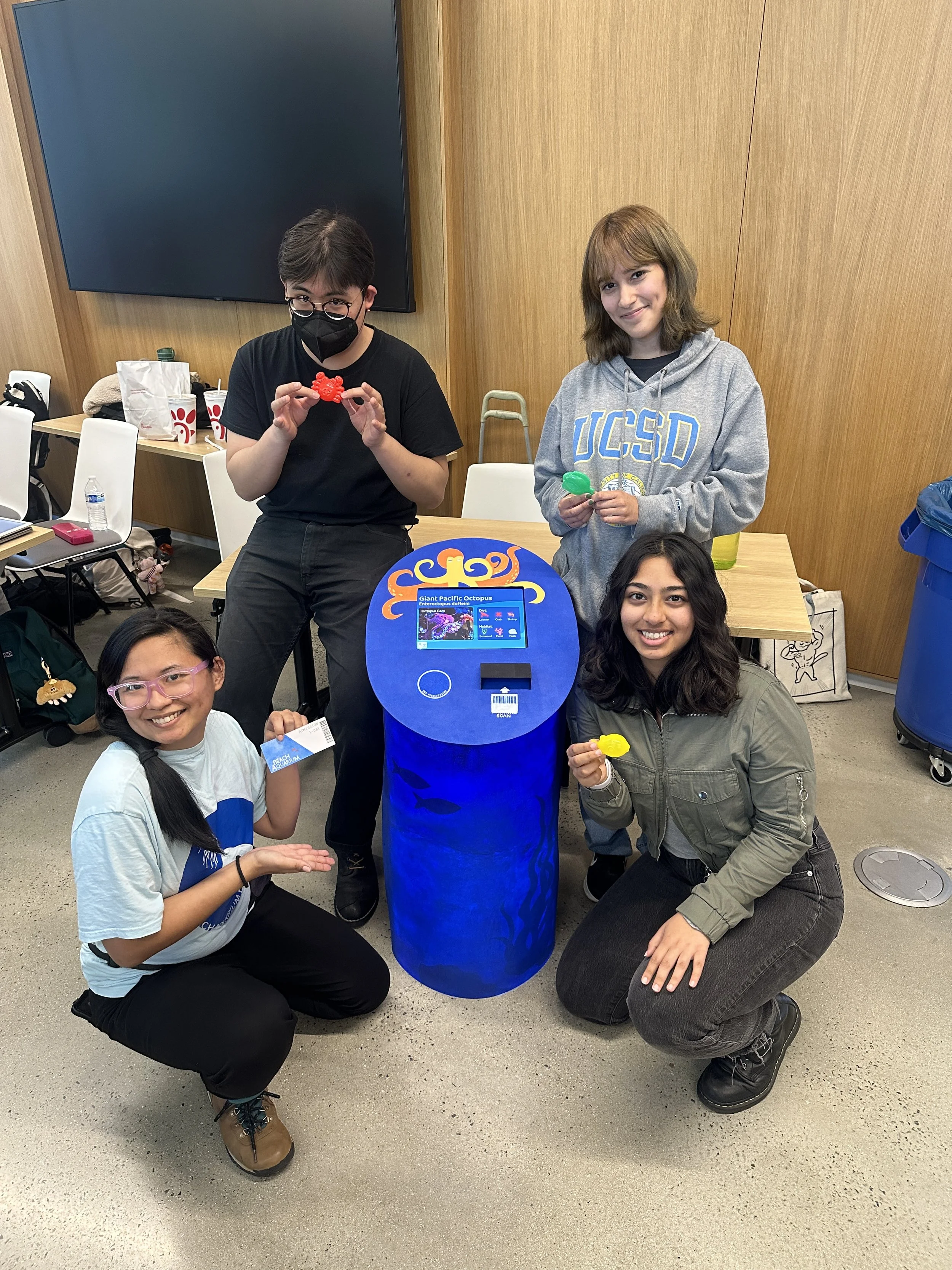
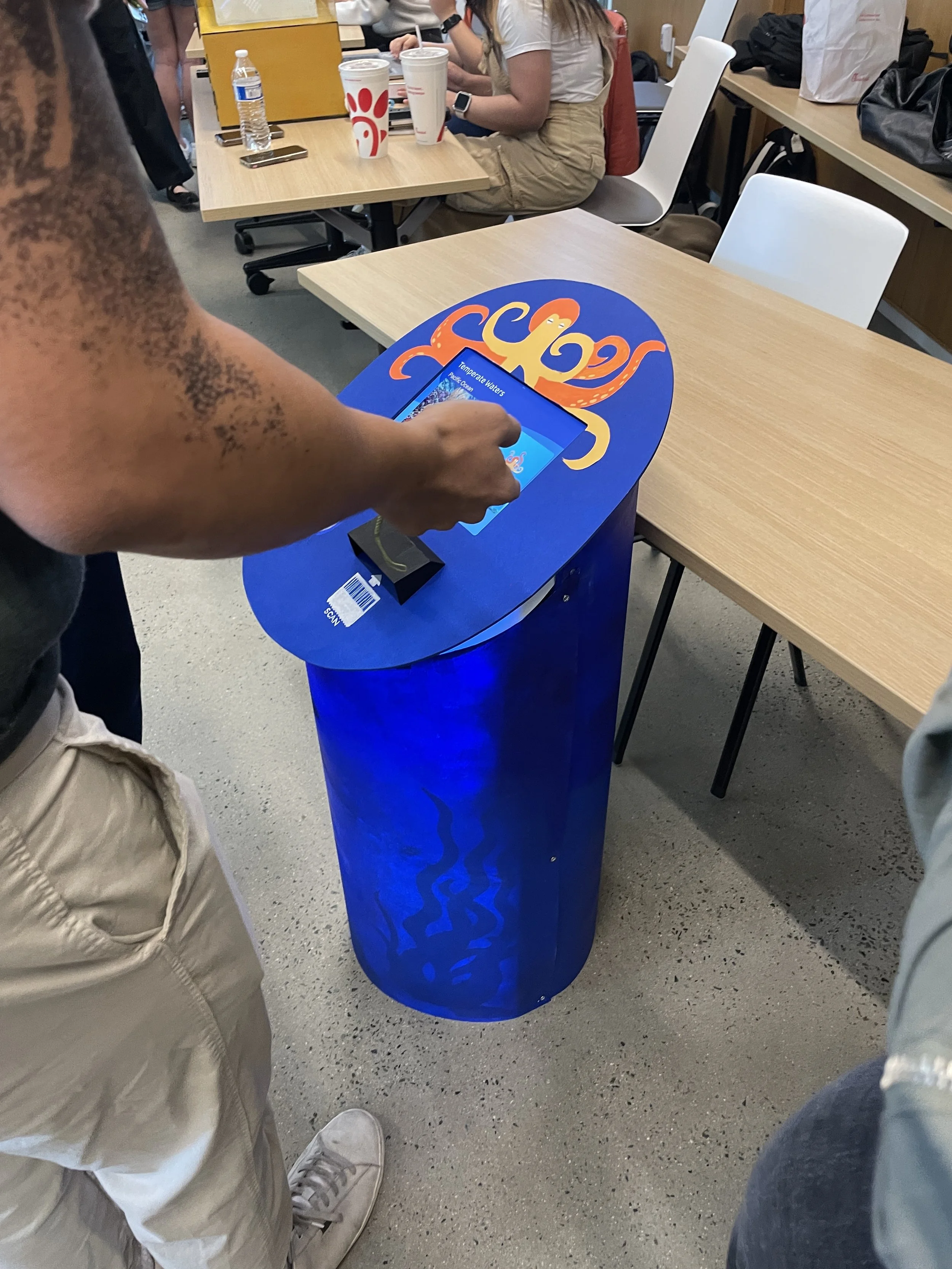
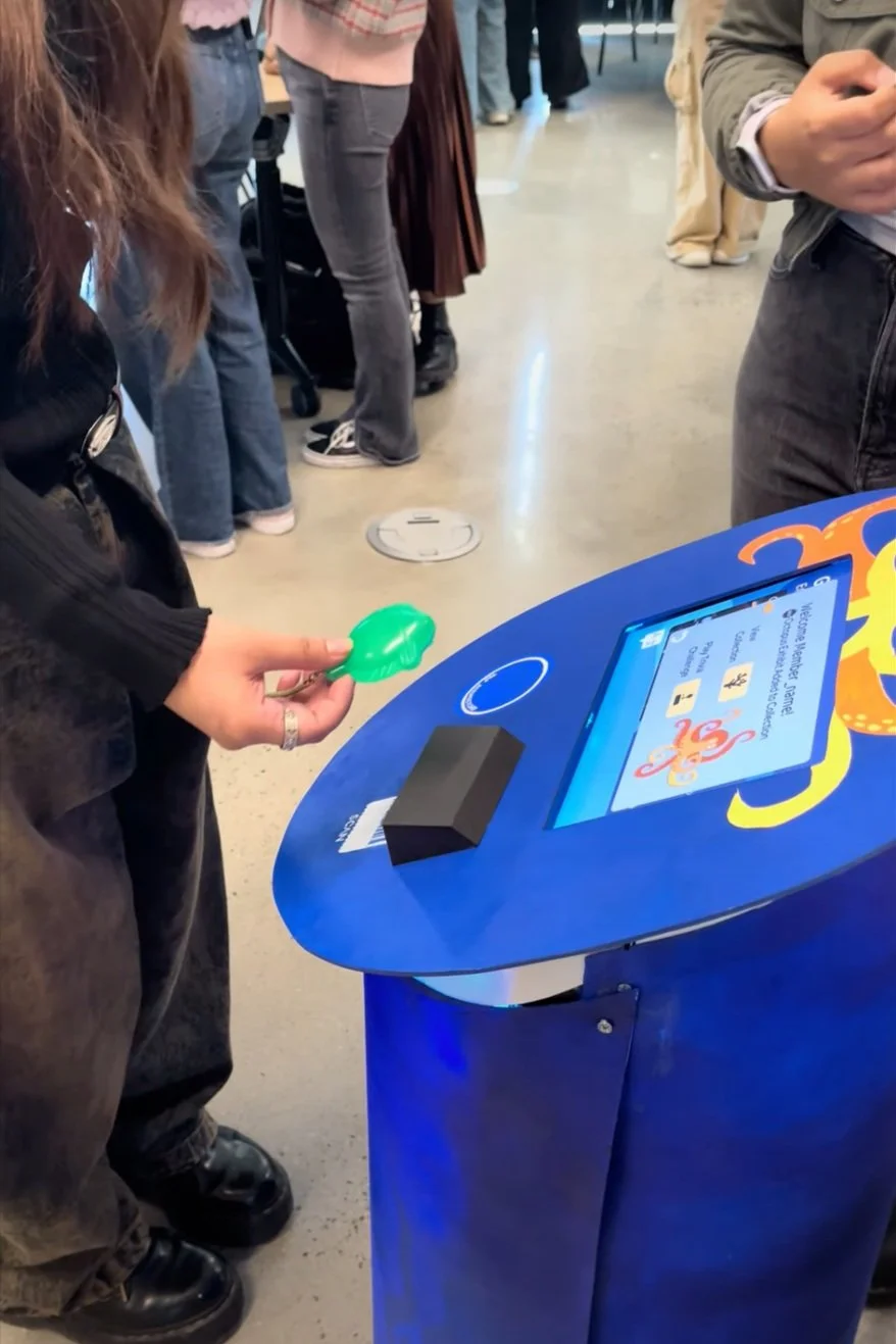
We delivered and presented our final product at the marketplace exchange of kiosks. Our users were most amazed when the kiosk lights up when they scanned the membership charms.
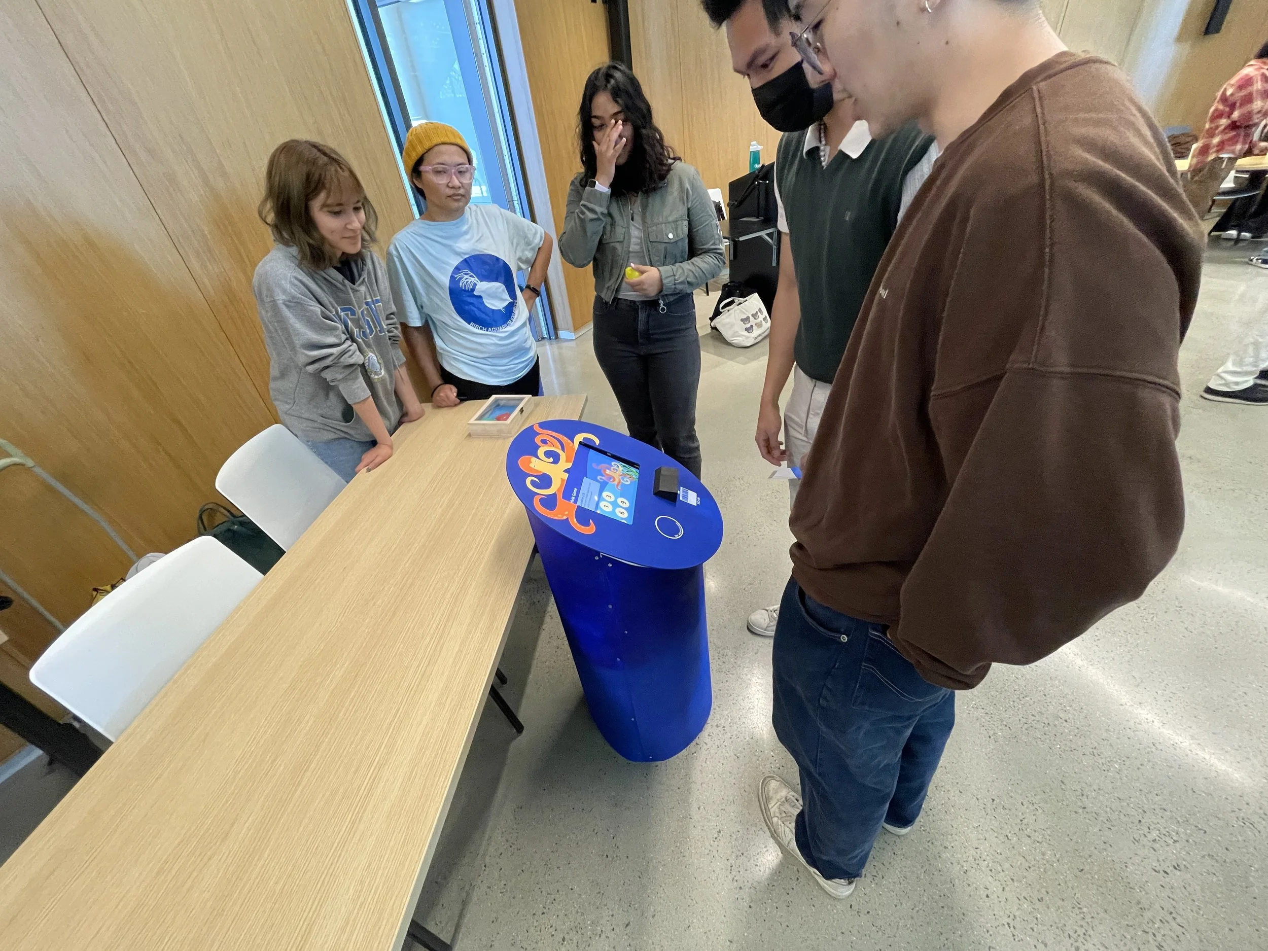
Us at the marketplace exhange.
The kiosk lighting up when the charm is scanned.
Users interacting with our kiosk at the exchange.
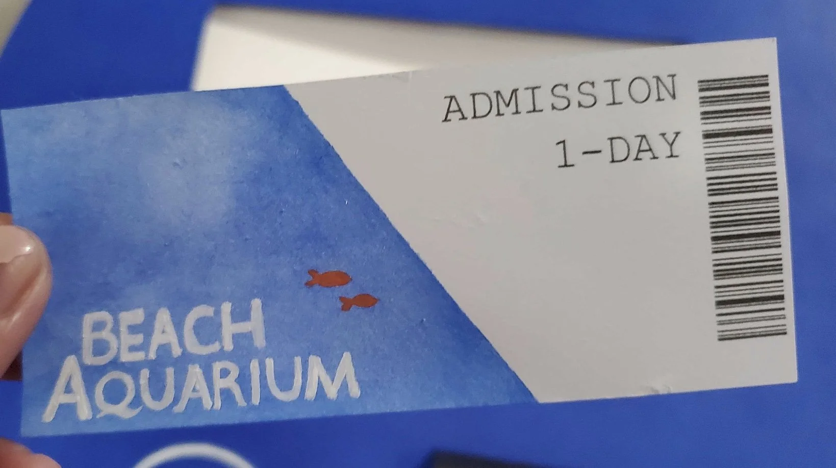
Users with day pass tickets and users with membership charms have different interactions available to them. We included tickets and charms as extensions to the kiosk. They bring a more complete user experience, and allow us to fully take advantage of the aquarium kiosk form factor. This creative solution to our goal of incentivizing users to buy membership intrigued many visitors at the exchange.
Scanning a membership charm unlocks the animal collections.
